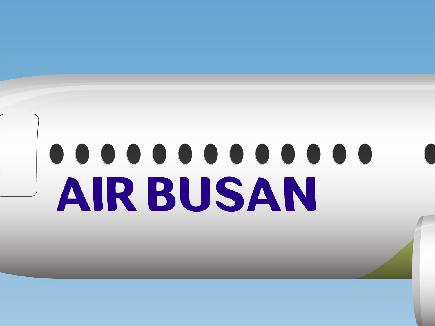
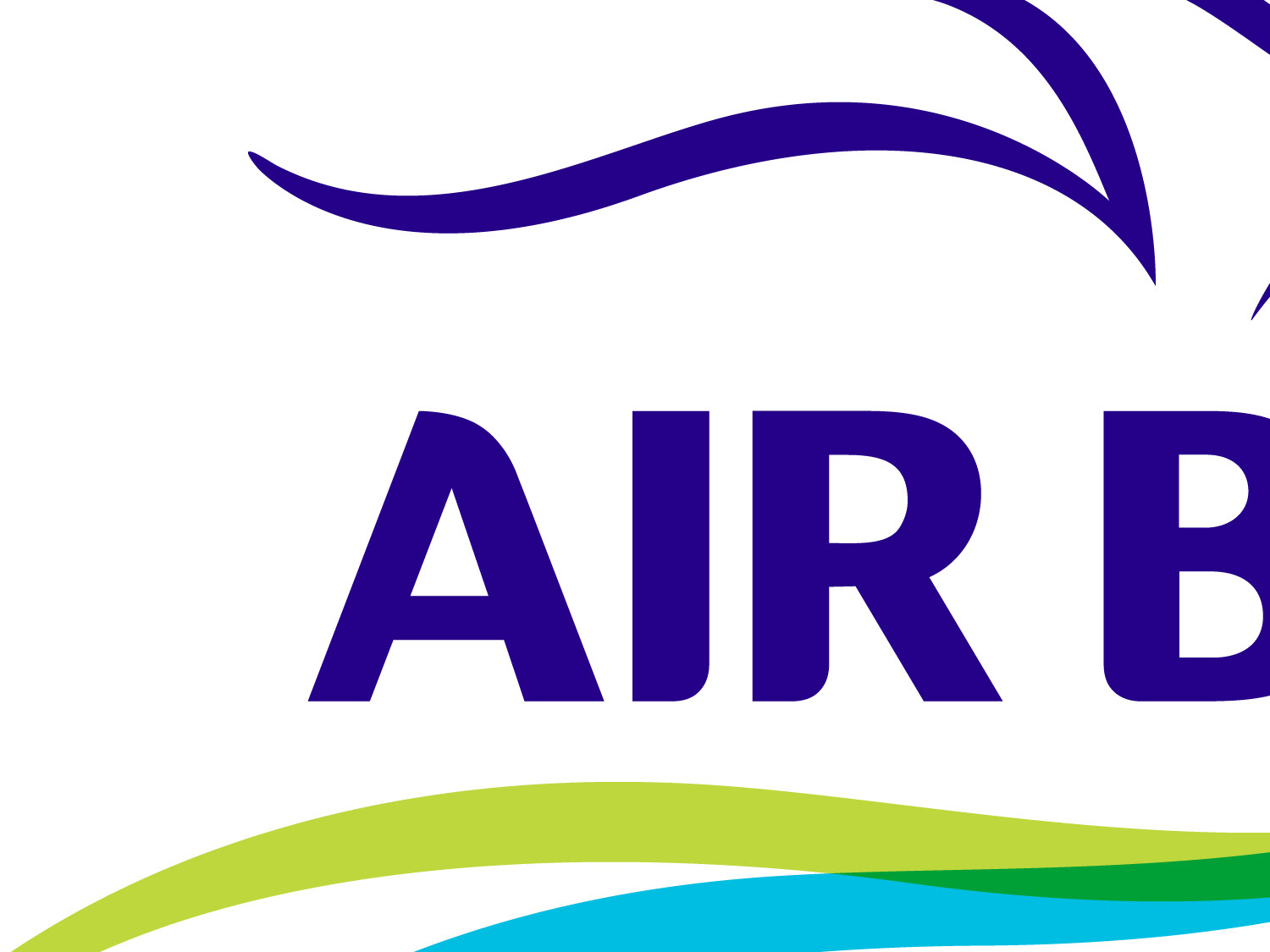
Air Busan is a good example of an almost-there logo and typeface system. The logo is sound, and while the Korean version of the typeface is unique and well crafted, it doesn't match the English version, which is simple but unremarkable.
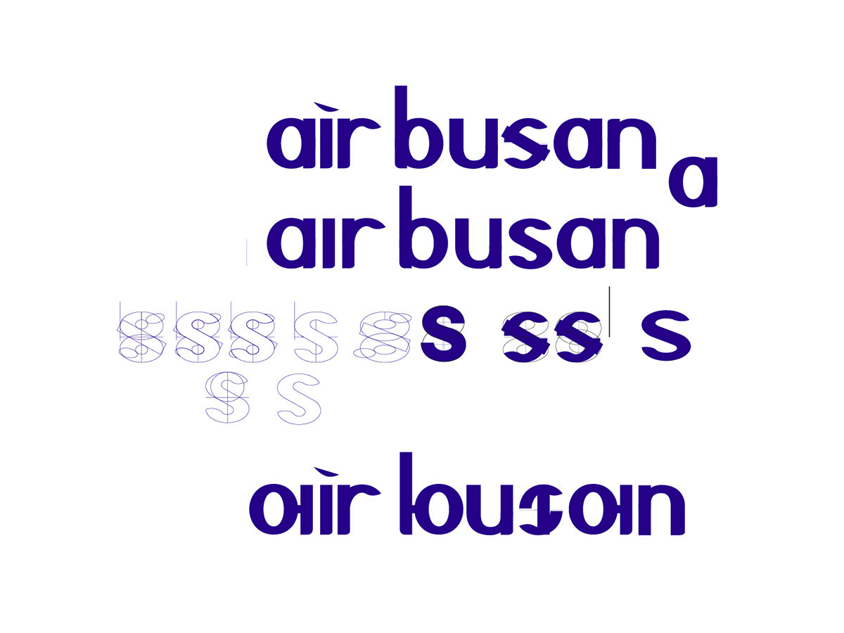
This is a version which brings some unity to the typefaces by incorporating aspects of the Korean version into the English typeface.
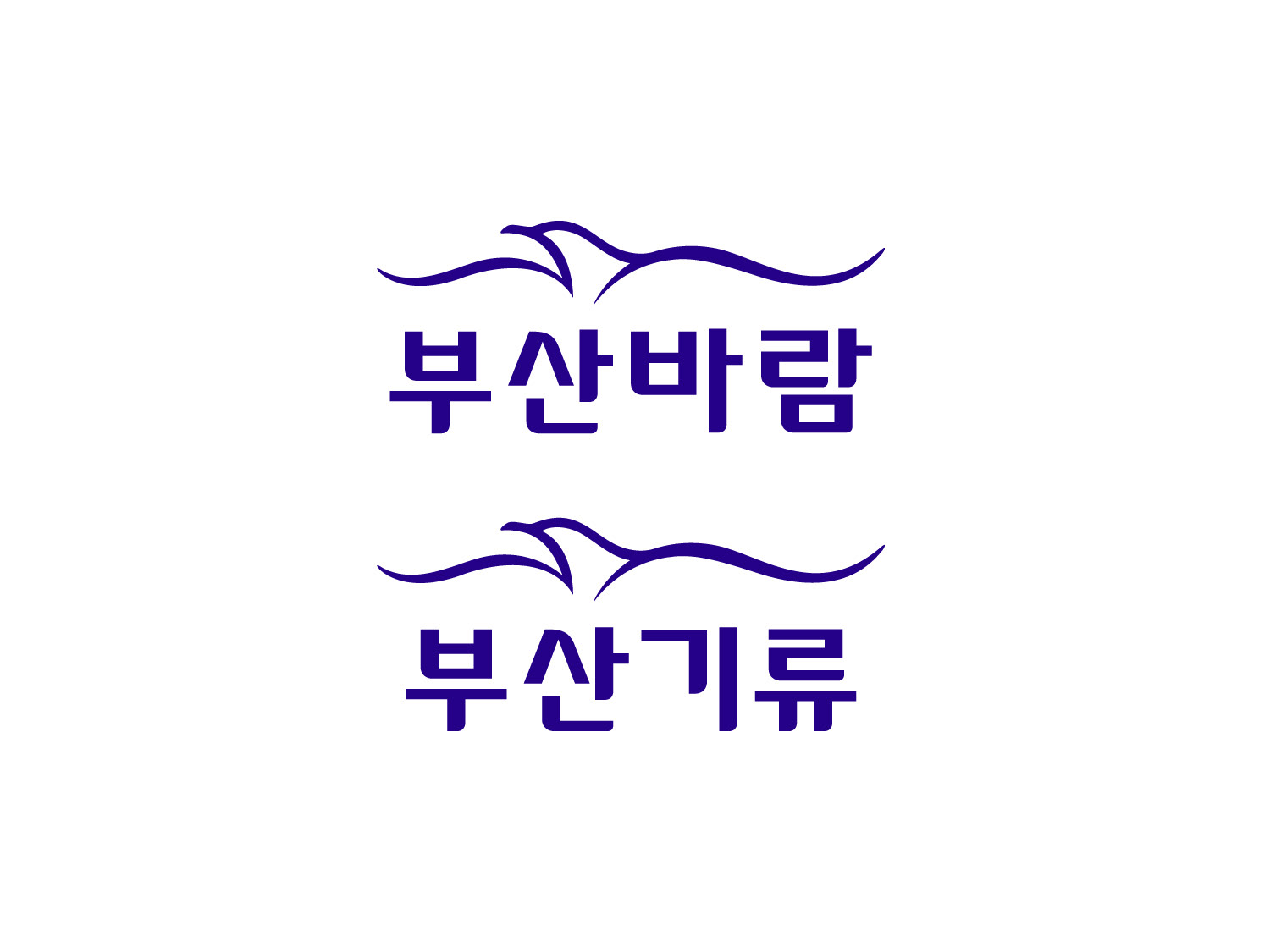
I also played around with some of the linguistic oddities present in the Korean name of the company and created an alternative Korean version using the same typeface elements.
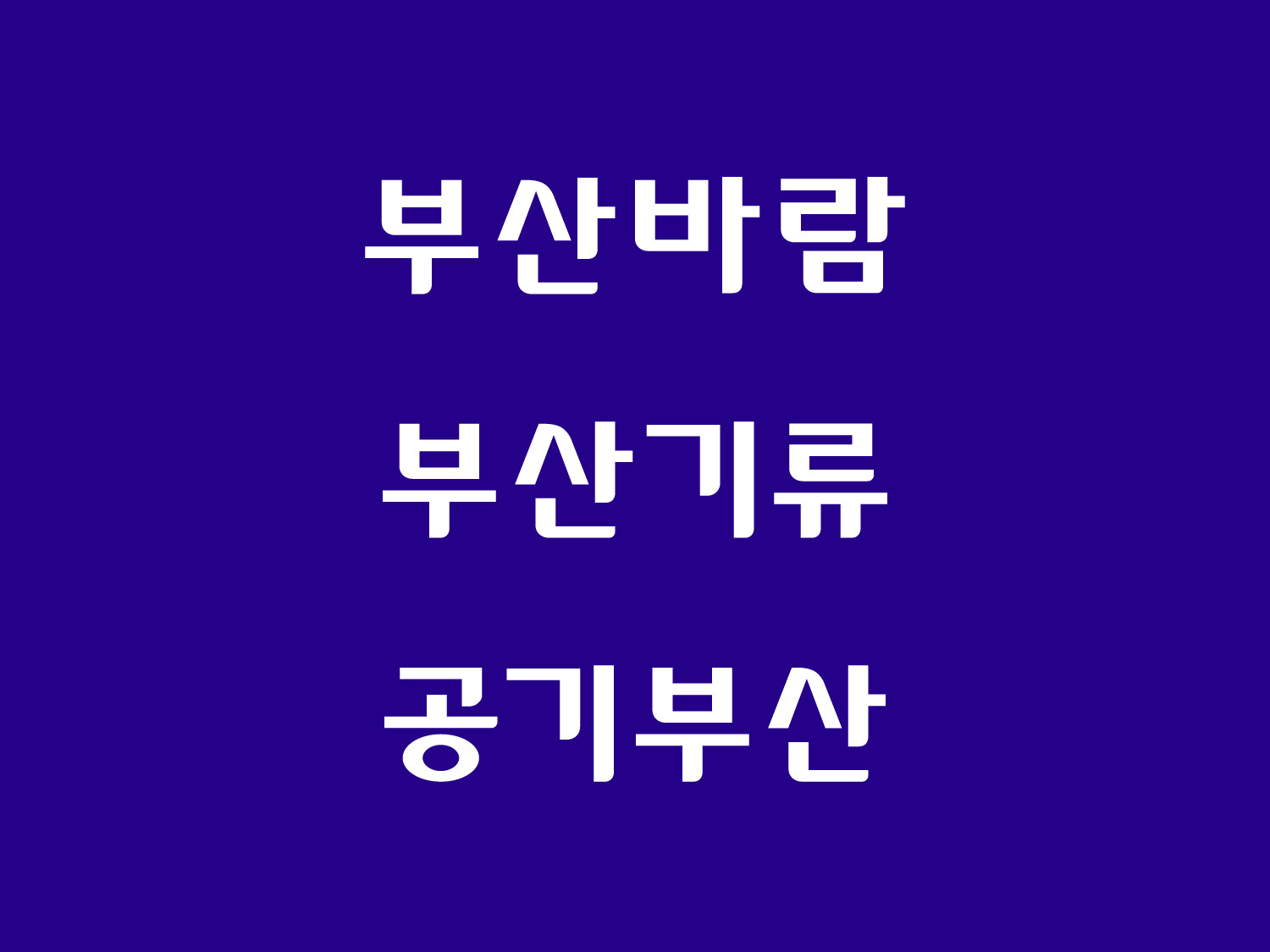
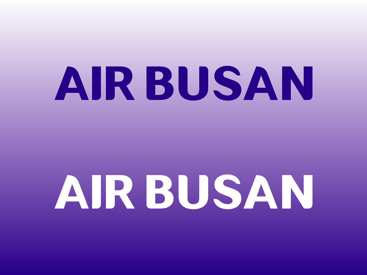
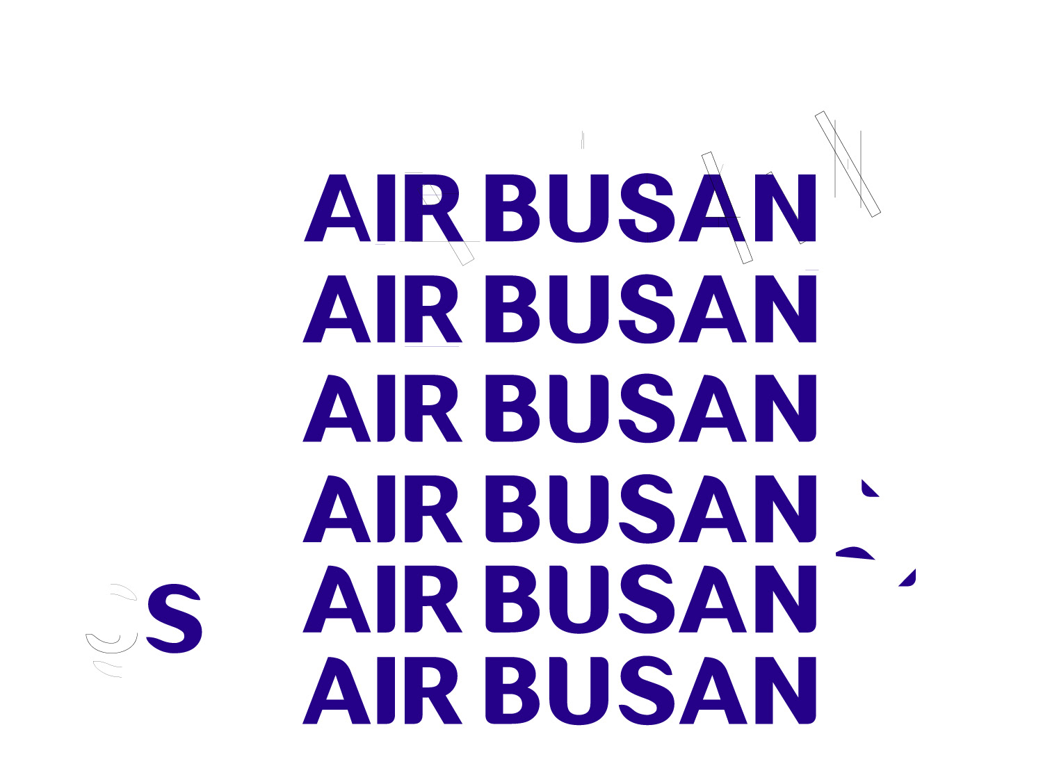
All caps.
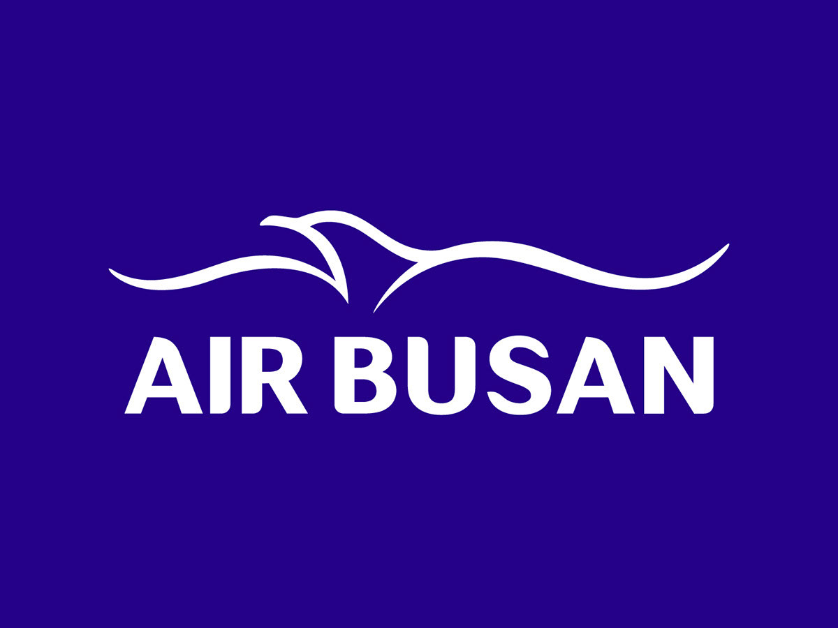
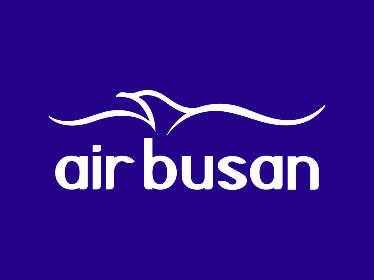
Color combinations and a lower case version.
Some of the process.
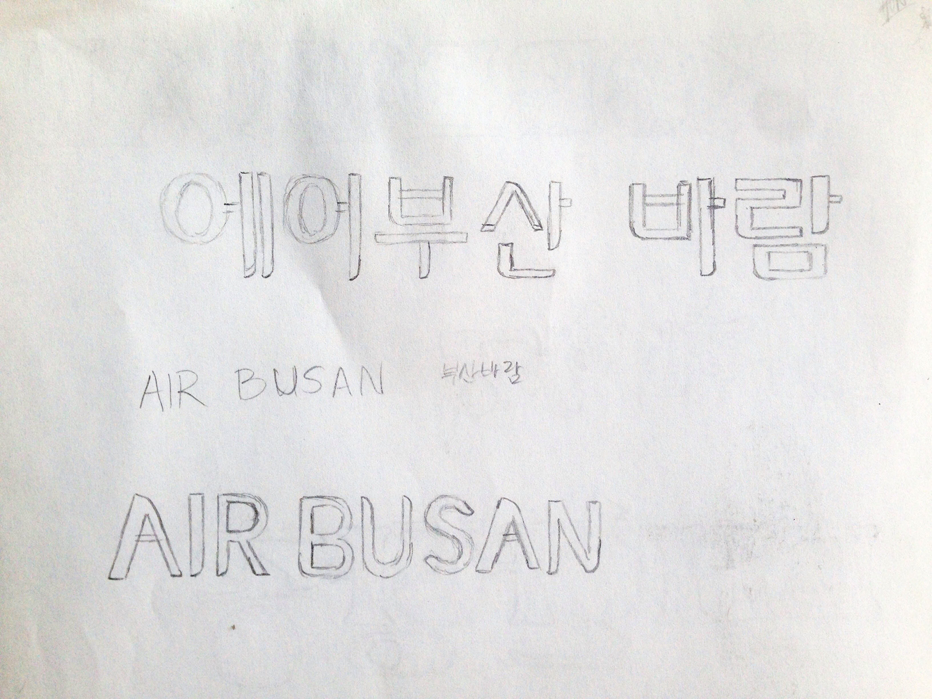
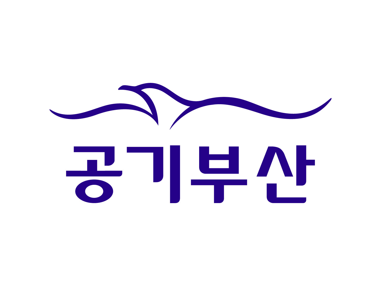
If it were really "Air Busan" in Korean...
and a couple other alternatives.